
pplater
5425

Dufour and Voutilainen...
It’s the answer to the question that no-one should ask, but since a few have asked, here (for what it’s worth) are some strictly personal observations upon the Philippe Dufour ‘Simplicity’ (“PD”) alongside the Kari Voutilainen ‘Observatoire’ (“KV”).
Both watches are made by AHCI members; both are simple time-only watches; increasingly frequently, both are mentioned in the same dialogue. Why? Apologies in advance for the lack of academic rigour in the comments and for the quality of the photos, which are really intended for illustrative purposes only.
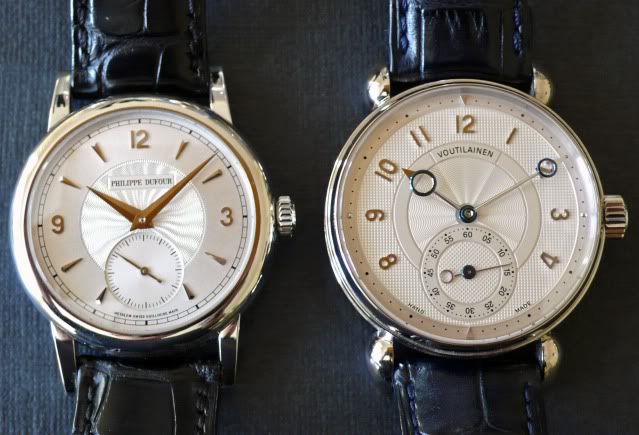
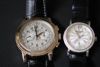
The cases.
It is perhaps unfair to be comparing cases in two different metals: in these examples the PD is platinum whilst the KV is white gold. The platinum case is of course heavier (all other things being equal), notionally harder (more resistant to swirls, dings etc?) and ‘brighter’, whilst the WG might be thought to be a little ‘duller’ but ‘warmer’. The PD appears to be available only in noble metals; the KV has recently been manufactured in stainless steel and titanium also.
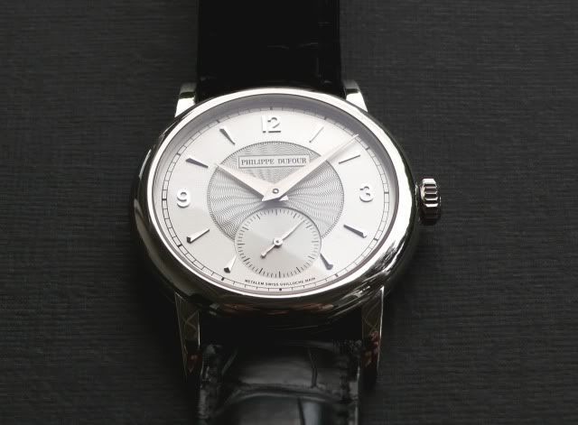
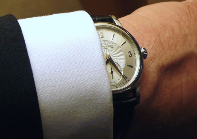
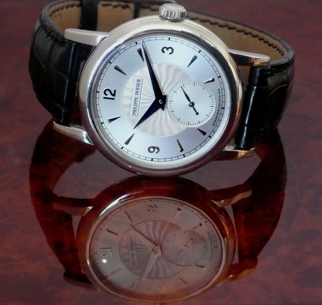
The 37mm case on the PD is effectively segregated into three sections. The mid-section is precisely the same width as the lugs at the point where they join the case, and the top and bottom sections (thinner than the centre) are the same depth as each other, giving the watch a symmetrical side profile. Sapphire to sapphire is 9mm.The upper section rolls 3mm in from the edge of the case, the lower section a fraction more, and each – without any joins, seams, or markings - merges seamlessly with the sapphires.
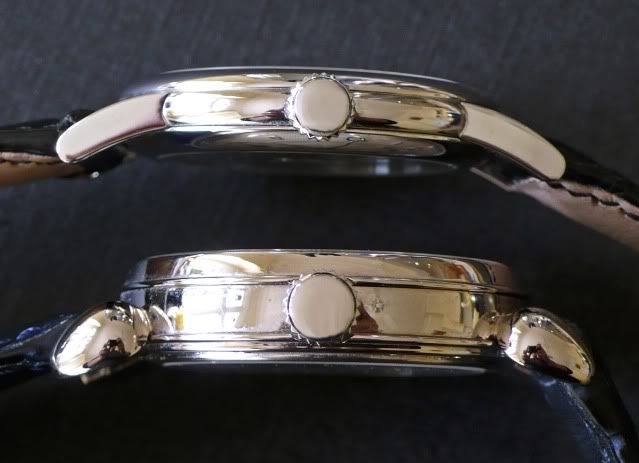
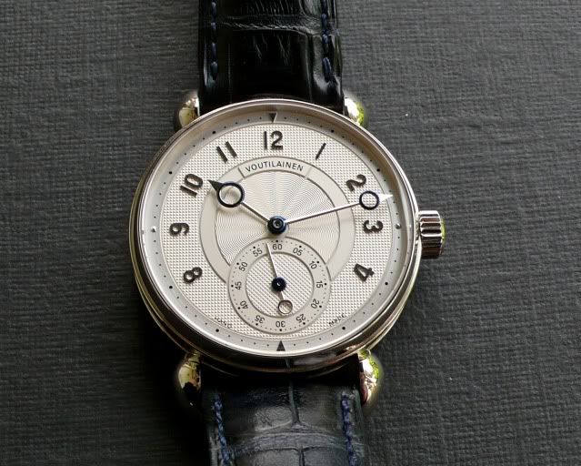
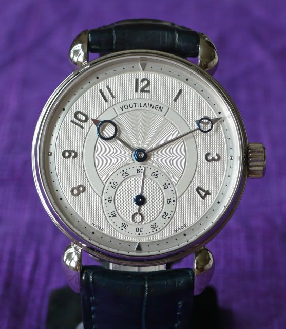
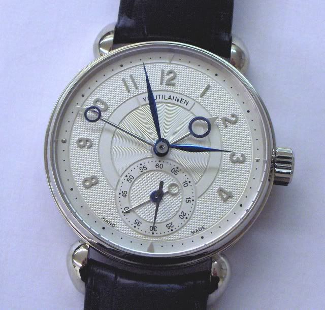
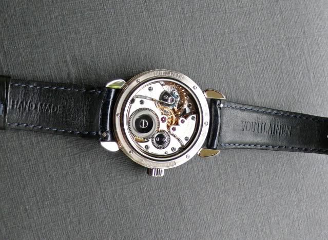
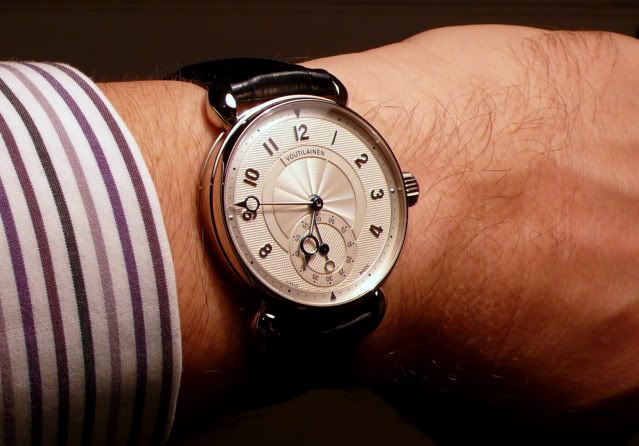
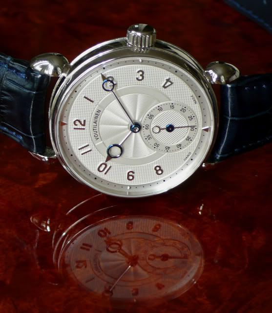
The 38mm KV case is also segregated into three sections where the centre section is wider than the top section which in turn is wider than the bottom section. Additionally, the lugs are joined to the lower portion of the centre section, so that the watch sits higher off the wrist than it might if they met the case at a centre point. Sapphire to sapphire is 11mm. The upper bezel of the KV is only 2mm wide at the rim and has a more angular, upright form than the PD, offering up more of the dial. The stepped backplate is held in place with 6 custom-shaped screws. It also carries the signature and hallmarking of the watch, together with an engraved statement of the Limited Edition status of the watch (just how LE has yet to be determined; as other owners have advised, the likely final number would now seem to be more than forty, less than forty-nine)
The crowns.
The slightly domed and unsigned crown of the PD is 6mm in diameter and sits 2.5mm off the case; the flatter-topped unsigned KV crown is perhaps .5mm larger on each dimension. Each has a wonderfully affirmative physical ‘click’ when rotated – you can ‘feel’ the wind, in the same way that you can ‘feel’ the gearchange in a well-sorted sportscar. Interestingly and counter-intuitively, the audible ‘click’ of the PD is a lower pitch than the KV, despite the movement being housed in a narrower case: a function of the resonating characteristics of the respective case metals, perhaps?
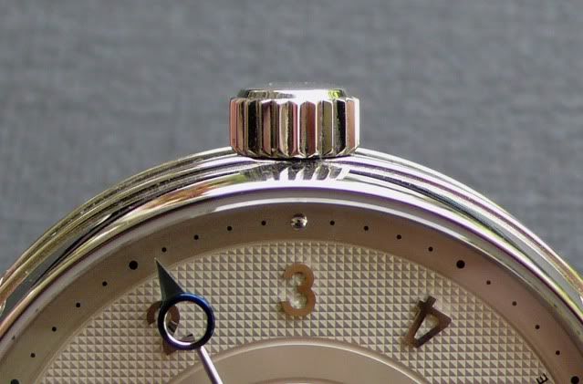
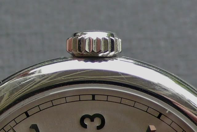
There is a fair amount of ‘recoil’ on the KV crown which requires approximately 29 turns for a full wind. It is an easy wind for the first dozen or so turns but then offers a healthy resistance. The PD requires nearly 40 turns for full wind: there is no ‘recoil’ and resistance increases only in the last two or three turns.
The lugs.
The lugs of the KV are fast becoming one of the signature touches to Mr Voutilainen’s watches: a shape somewhere between teardrop and ‘cornes de vache’. They are pure whimsy: achingly beautiful and a very clever curvilinear counterpoint to the otherwise almost angular, precise proportions of the case and crown. In a watch which is otherwise quite modern in proportion and design they are an honourable and respectful nod to tradition. Famously, though, the most ‘bespoke’ of the Observatoire series (that commissioned by Felipe Jordao) was built with straight lugs: it works equally as well (some would doubtless think better) in that iteration.
The lugs of the Simplicity are of a more prosaic design: gently arched, nicely tapered, in good proportion to the case and seamlessly integrated. No more and no less than their function requires them to be.
The dials.
As mentioned, the case of the KV offers up more of the dial than the PD – a visible diameter of 33.5mm, as opposed to 30mm, despite the case sizes being only a fraction over 1mm difference in diameter. Each is available in a range of materials and colours (in the case of the Observatoire, seemingly as many as there are watches) and each is outsourced.
At the outer edge PD opts for a classic ‘railway track’ (this is brought inboard a little on the 34mm version) whilst KV utilises a narrow band featuring dot markers for the seconds (in this case, with applied arrowheads at 6 and 12 – dots are an option). The flat surfaces of the main PD dial and the sunken subdial have a minute grainy texture which gives the dials their sheen and the wave pattern radial guilloche in the centre of the dial is expertly executed: quite hypnotic.
KV marks the transition from numerals band to centre dial and subdial with engraving and textural differences, in this case with guilloche on the inner and outer sections of the main dial and on the subdial. Again, the available variations and designs are numerous: the dials may feature one, two or three guilloche elements in any combination – or none at all.
The hands.
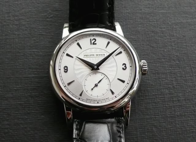
The hands of the PD are ‘dauphine’ style, very sharply defined and in good proportion to the watch overall. The hour hand finishes precisely at the edge of the inner dial ring; the minute hand precisely at the outer edge of the railway track. The ‘elongated leaf’ shape of the second hand with its plumb-bob tail finishes at the very edge of the seconds track and is an effective coupling with the larger hands.
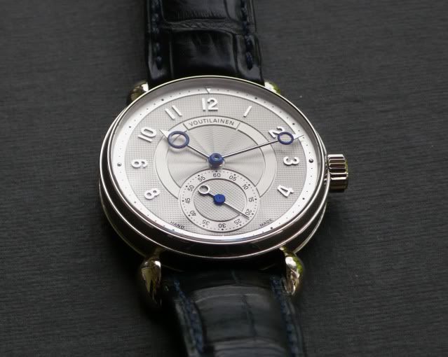
The hands of the KV, of course, have become another signature touch. Not surprisingly, this exaggerated Breguet design is also described as ‘observatory style’ and they are very distinctive in this modern interpretation. The minute hand finishes right above the minute indices and the hour hand, although overshooting the inner dial track, finishes precisely beneath the numerals. The point of the tapering second hand finishes precisely over the second indices at the edge of the outer subdial track whilst the ring on the tail of the (straight!) second hand extends out to the inner edge of the guilloched portion of the subdial. In this case, the hands are the default combination of white gold with blue gold rings and centres, but Mr Voutilainen has been prepared to supply the standard hands in different colours and has also consented to make ‘sword’ style hands (the Felipe Jordao model again) and blued steel ‘leaf’ hands.
[photo of overlaid hand options courtesy KV]
The numerals/indices.
KV offers applied numerals in different metals, in Arabic or Roman, and oriented to specification, i.e. vertically aligned, radially distributed, with or without so-called ‘radial flip’. Presumably, a version without numerals is feasible. The fonts are ‘sans serif’ and suitably modern.
The dial of the PD features vertically oriented Arabics at 3, 9 and 12 in case colour interspersed with like-coloured beveled spearhead indices for the other hour markers. In a nice touch, the spearhead indices for 5 and 7 are not truncated to accommodate the subdial – they are manufactured to the same shape as the others, but smaller. The font used for the numerals is very similar to that used on the KV (and many other watches for that matter – have a look at the JLC M.U.T. for example).
Because the KV uses more numerals around the dial, and uses numerals, not markers, in the sub-seconds dial, it declares its purpose more deliberately than the PD which, by resort to indices as substitute for numerals, subjugates function more to form. This is a question of degree, however; with either watch you can readily tell the time and both acquit the function with ample style.
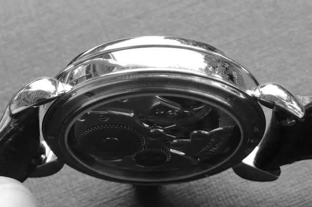
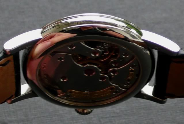
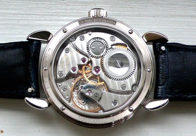
The movements.
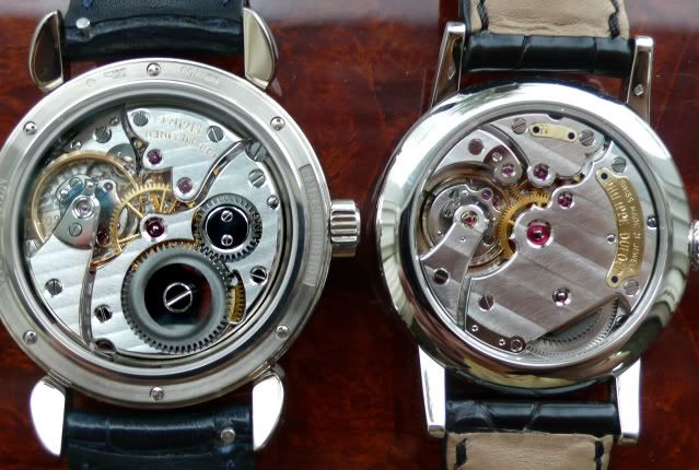
As is well known, the movement design of the PD is proprietary; whilst some commentators have noted its similarity to a JLC calibre, it has also been said that there are just so many ways a time-only movement might sensibly be configured. The KV on the other hand houses a re-worked Peseux 260 movement designed for Observatory trials. Each of these watches is heralded not so much for the design of its movement but, rather, the exacting level of finish. These photos do not begin to impart a sense of that quality. There have been other photographs before now, and there will be many others to come, which explore in microscopic detail the precision of the anglage, perlage, black polish, engraving and so on. For that reason, these comments will be limited to a few personal impressions only.
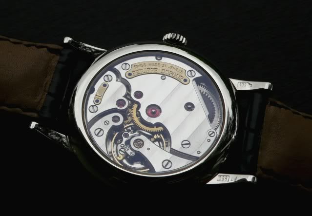
The PD withstands scrutiny even at extreme magnification: it is difficult, if not impossible, to detect a flaw or shortcoming. The concave and convex curves of the bridges are pure liquid. How is it possible to tighten those minute screws without leaving the faintest trace of the screwdriver? Even the individual brush-swirls on the Cotes de Genève stripes – a fraction of the width of a human hair - seem to be parallel. The two curved plates bearing the maker’s name and model number have been inserted into the bridges with zero ‘tolerance’, and the engraving of the name and model number (a serif font, for the most part) is beautifully executed. Again, the number in the series is not detailed on the plate: there were to be 200 pieces, however.
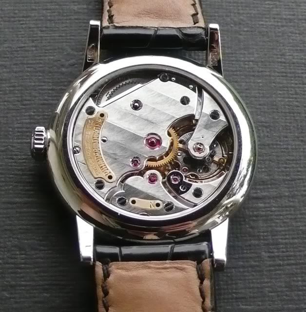
The focal point of the KV is that glorious balance-wheel. Just to look at it is to know that the watch is a purebred; one which has been regulated to the ‘nth’ degree by a master.
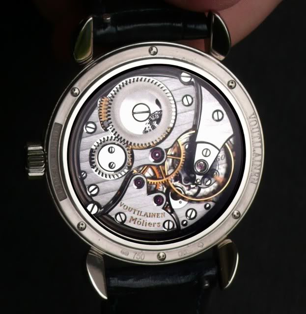
Perhaps because of all of the detailing on the retaining bezel, the exposure of the barrel wheel and the fractionally deeper case, or perhaps because of the absence of a ‘nameplate’ or other flourish such as found on the PD, the KV seems more purposeful than the PD. It is also noteworthy that the gap between movement and case is measurable: perhaps, though, that is a practical result of the use of thinner bezels, allowing greater visibility of movement and dial. Again, however, it is mind-boggling to think that micro-engineering to such small tolerances, and finishing to such minute detail, has been achieved by hand.
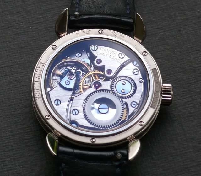
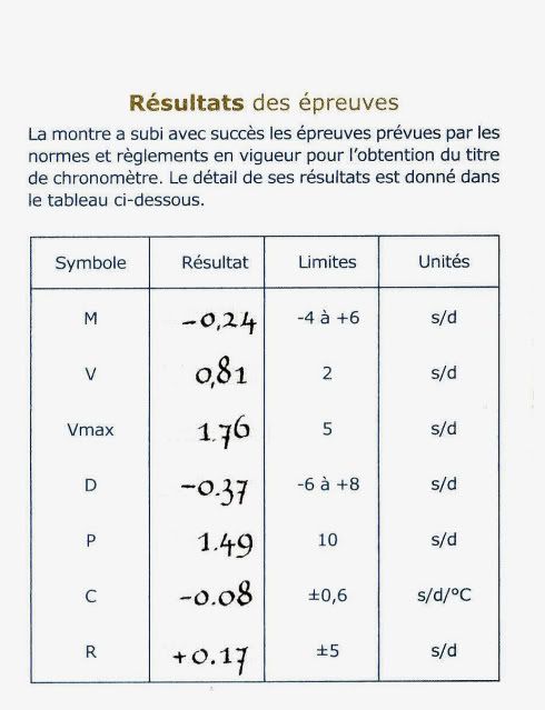
Accuracy is a matter best left for others to comment upon – those with a sufficient understanding of these things to comment meaningfully. The KV, though, stands by its pedigree: the watch may be tested at the Besancon Observatory (a valuable service arranged by its creator) so that the performance of the piece is beyond question;
The straps.
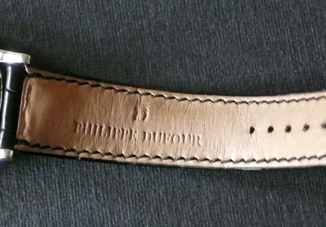
Both are alligator, both are slightly padded, lined and well made. The PD is 19mm at the (straight) lug end tapering to 16mm at the buckle; the KV (curved at the lugs) is 20/16mm. Some of the earlier PD straps were apparently full grain alligator top and bottom; this one is lined underneath. Incidentally, KV delivers an Observatoire with three straps and, as can be seen, some straps are fitted with ‘quick-change’ springbars.
The buckles.
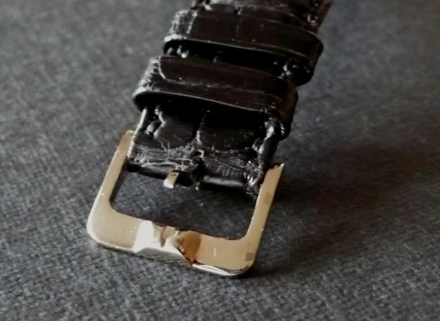
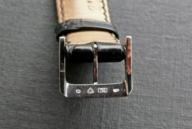
The PD tang buckle is high polish white gold, with a solid tang and a raised section to receive the tang. It is fitted with a springbar. It is not signed but it is distinctive.
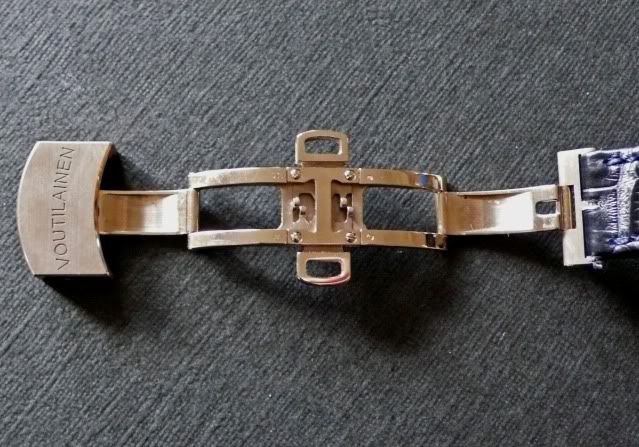
The KV, by contrast, is a signed brushed steel butterfly deployant with a sprung double catch and threaded pins. It unquestionably feels more secure than a tang buckle, but one can’t help think that it would have been preferable if it were a little less bulky (the clasp alone, when closed, stands nearly 10mm off the wrist) and an option in white gold.
The ‘feel’.
It’s a very personal thing. For one who habitually wears watches at 40mm+, the PD can feel a little small on the wrist when first strapped back on. That feeling passes after time. The KV doesn’t suffer from that effect at all, probably because of its more substantial case, more open dial and more ‘present’ lugs.
The PD is ‘stealthy’, the KV less so (the lugs and hands are often noticed and commented upon), but both are magnetic, even to the uninformed observer.
Rightly or wrongly, the PD feels less robust/more fragile. Perhaps it’s a subconscious insecurity which flows from having such a precious thing hanging on a tang and a springbar, but there you have it. The upshot, though, is that the KV is worn more readily and more frequently. Both are easily worn at any time; with jeans and loafers, with business suit or with formal dress. Given its modernity and size, however, the KV feels more natural at the casual end of that spectrum and the PD, because of its classic – errrrr, simplicity - feels more natural when at the formal end of the spectrum.
The experience.
Each of these watches is a thing of beauty. Each is ‘haute de gamme’ in the world of Independent manufacture. If one were to attempt to relate one to the other by reference to external markers, then it might be considered that, to this point, one of them has rightly been the high water mark of artisanship to which all others have aspired, whilst the other has emerged to claim a rightful place on that same podium. In that respect KV would be to PD what Picasso is to Rembrandt; what Usain Bolt is to Jesse Owens; what Koeniggggssssseeegggggg is to Ferrari; what Stag's Leap is to Ch. Latour; what Gehry is to Lloyd Wright. Oops; starting to wax a bit lyrical here – apologies. You get the drift.
The conclusion, though, is easy to reach; there is no first amongst equals.
If you are still here – thanks for your interest.
Cheers,
pplater.
This message has been edited by AnthonyTsai on 2009-05-23 09:47:23 This message has been edited by SJX on 2009-05-29 00:26:10
Dufour and Voutilainen...

That's a Hell of a Post, pplater

Incredible post
Terrific 1000th post, just terrific!

Thanks a lot pplater !
thanx

Amazing post and comparison

Fantastic comparison PPlater!! FWIW, I much prefer the KV!
Have just read...

First off, congrats on your 1000th post!!

Wow! Fantastic comparison and reference

Simply wonderful article and will be read by many in future :-)
Thanks

Great comparo write-up PP.

A brilliant post Kevin

Thanks for the excellent post, Pplater!

Congratulations from me too…

Thank you for a marvellous report................

A tremendious hands on comparison...


Phenomenal 1000th. Post!

We are all here, pplater, attentive and at the edge of our seats . . .

Wonderful head to head review!
A fantastic post

Thanks pplater

Wonderful Watches, Matched With a Wonderful Post...

What a way to post your 1000th posting. A home run all the way.

Grandest 1000th post ever

Wonder what you plan to feature in your 10,000th post...

What a stunning post!

Thanks for this most brilliant and insightful comparison review
Wonderful post and great comparative analysis.

Honesty....
WOOHOO!!!...
Sometimes its about people.....

A great review and thanks for undertaking it - loved the read
I would think KV's is a "more" honest watch

This is the first time that I have felt that reading is BETTER than owning
Very interesting read, thanks a lot for sharing this info


Thank you sir, for this wonderful report.

What being high-level WIS is all about!
One (very small) potential correction?
Corrigendum and apologia...