
AnthonyTsai
[PuristS]
22938

Panerai PAM305 Submersible “On-The-Wrist” Review
Panerai PAM305 Luminor 1950 Submersible “On-The-Wrist” Review
by Anthony Tsai
© Dec 2009
What is Panerai’s secret sauce? How does a brand that produces watches which all look the same have such a high brand loyality? Why does its clientele keep coming back for repeat purchases? And how does this so-called infectious “Panerai virus” spread to hundreds of thousands of watch collectors and enthusiasts worldwide? These are questions that all watch brand CEOs seek the answers to.
The Panerai collector community (known as “Paneristi”) is one of today’s most, if not THE most, “crazy” and loyal of all specific watch brand communities. Die-hard Panerai fans, such as myself, struggle every day to combat the only known temporary cure for the “Panerai virus” – purchasing another Panerai. There are numerous Panerai gatherings across the globe, and each and every Paneristi are practically champions of the brand.
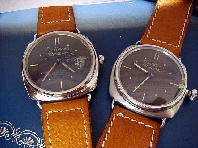
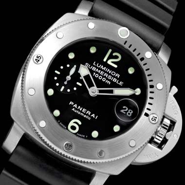
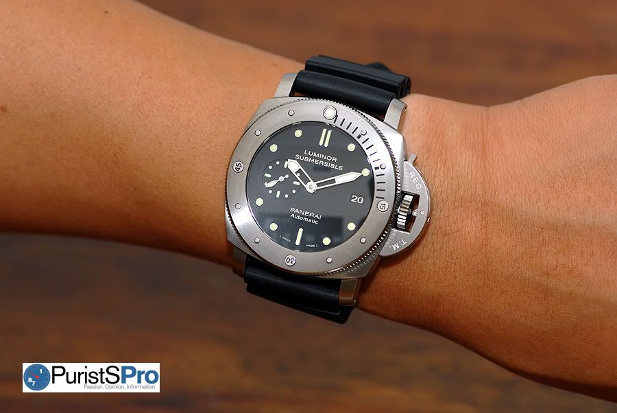
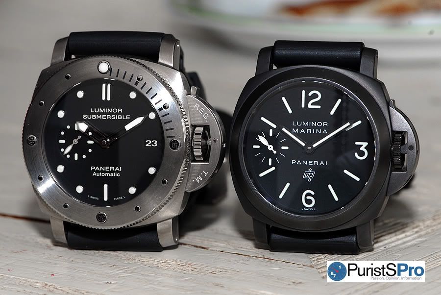
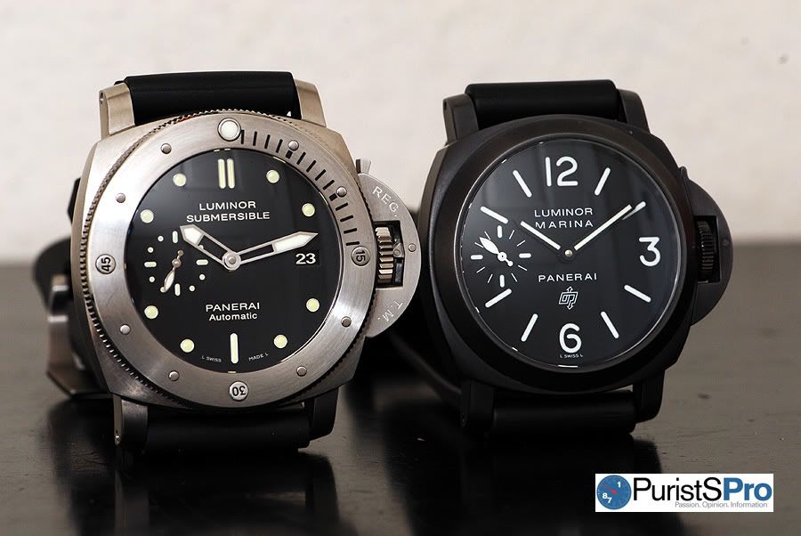
Today I will be reviewing a 47mm Luminor 1950 Submersible from the SIHH 2009 collection and a Panerai I consider to be one of Panerai’s best bangs for the buck – the PAM305. Those who do not understand the allure of Panerai cannot comprehend why we Paneristi’s can purchase so many watches that “look the same”. Let me say this though, the PAM305 Submersible has one slight change in the dial which surprisingly changes the entire look of this Panerai and sets it apart from the rest of line which “look the same”.
Case
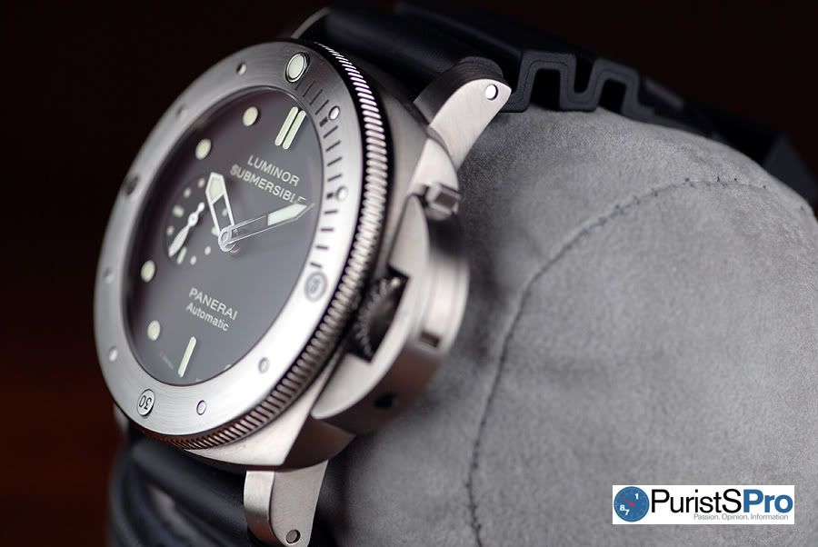
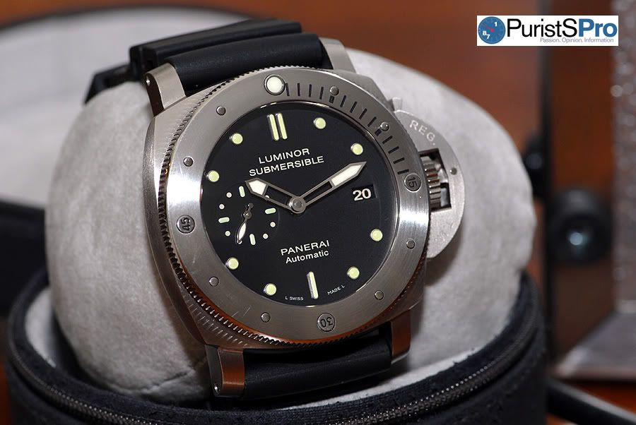
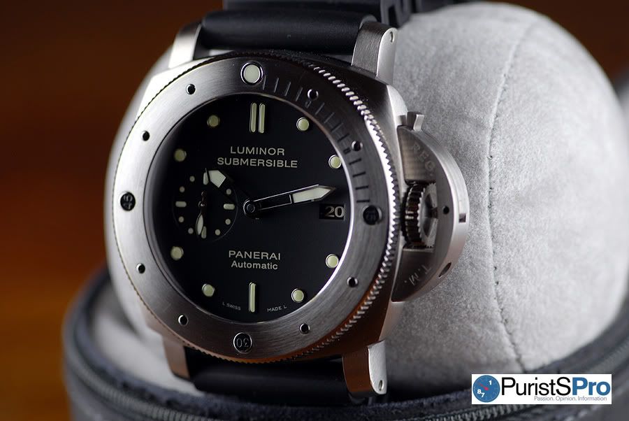
The PAM305 is housed in a titanium 47mm 1950 Luminor case which is an elegant, refined case and highly popular amongst Panerai enthusiasts. Below are a couple shots of the 1950 Luminor case at various angles. Notice the curves and strong lines of this magnificent case.
Fine satin brushed finishing of the titanium case
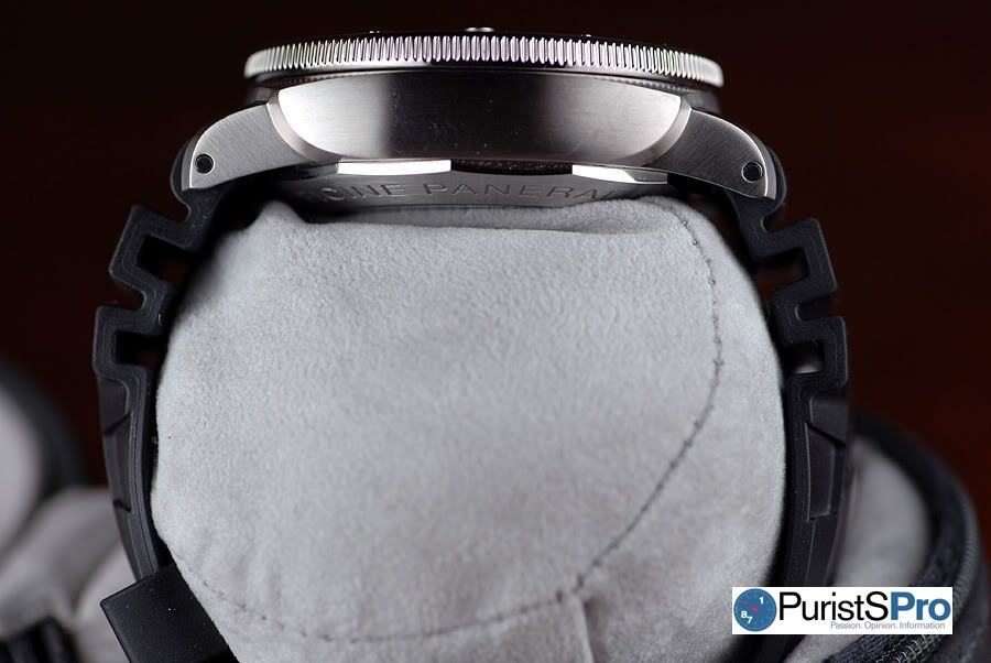
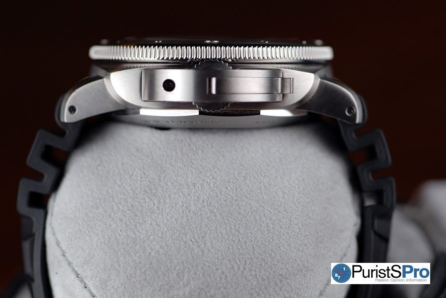
In the above picture, you can see how thick the PAM305 is. I forgot to use my digital calipers to measure the exact thickness, but I believe the PAM305 is around 18-19mm thick. From left to right including the crown protector, the width is 54mm.
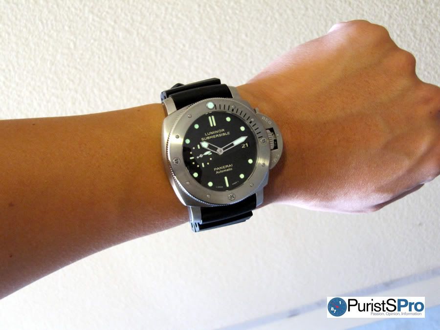
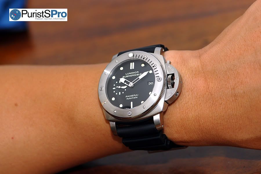
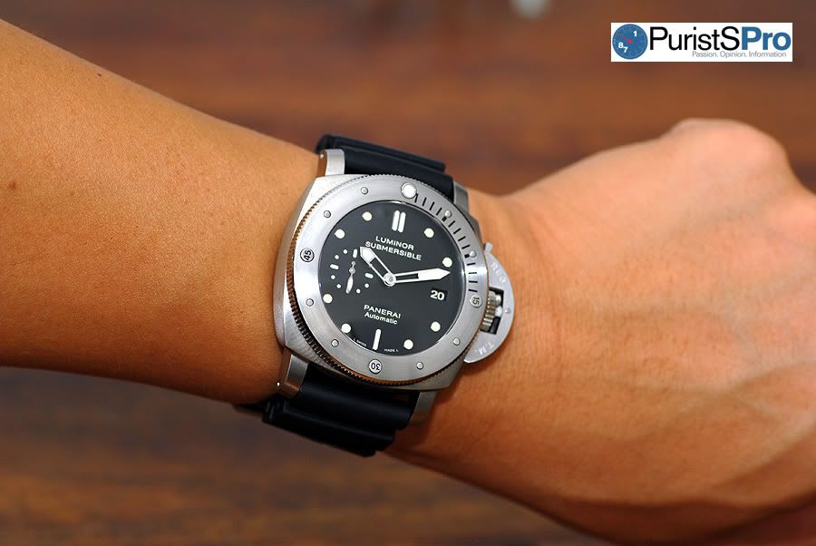
Size-wise, the PAM305 is definitely a monster. I’ve never owned a 47mm Submersible but am used to wearing my PAM203 which is slightly thinner and is housed in the same 47mm 1950 Luminor case. The PAM305 feels larger on the wrist due to the thick bezel. And honestly, even for me – a die-hard Panerai lover w/ a small 6.75” wrist, it took me almost an entire week to get used to the thickness of the PAM305.
Below is a HD video of the PAM305 on my wrist:
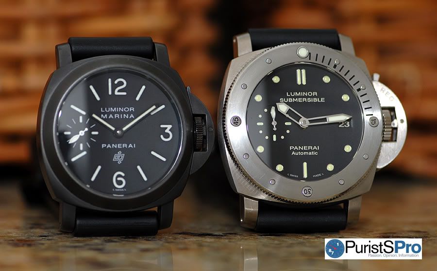
Comparison shot of a 44mm Luminor and 47mm 1950 Luminor
In terms of weight, the PAM305 is not as light as you would expect for a titanium watch. Surprisingly, the watch as a whole feels as heavy as my stainless steel PAM203. The bezel attributes for the added heft.
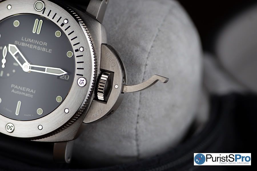
Bezel
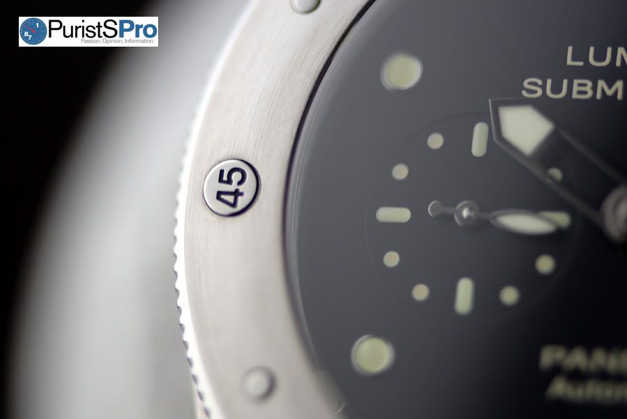
The feel of the uni-directional bezel is one of the best I’ve handled. When you turn the bezel, the loud, firm ratcheting pleasantly activates 3 of your senses because you see and feel the bezel turning as well as hear the clicking. The bezel isn’t loose and doesn’t jiggle or give way when you apply pressure to it.
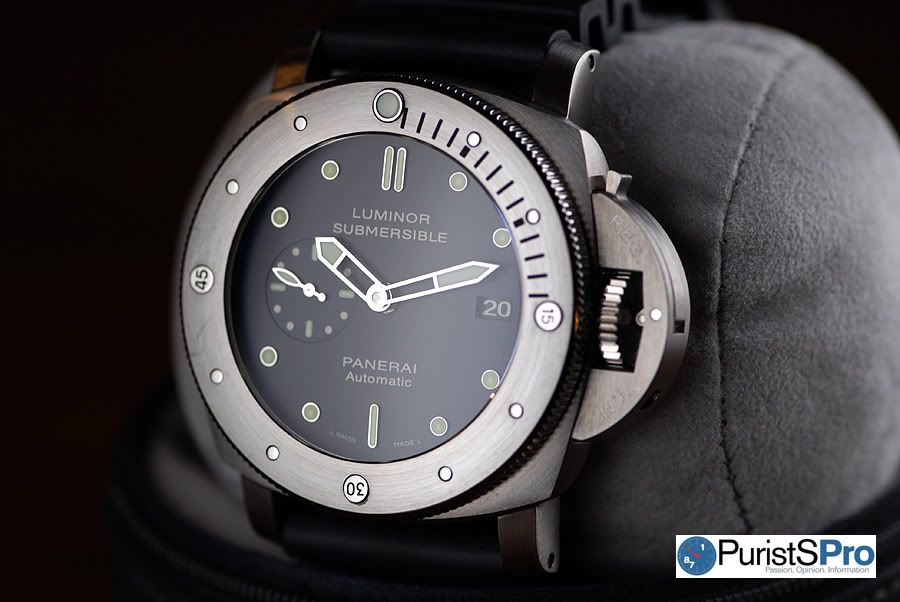
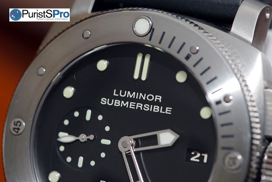
In the above picture, there is a 15-minute graduated scale on the bezel from 12 to 3 o’clock which divers can use to help time the lengths of their dives. Circular polished markers also line the bezel every 5 minutes and provide for functional visual contrast with the brushed bezel. The larger quarter hour markers are engraved with their respective minute designations.
If you compare the PAM305 bezel with other past Submersible bezels, you will notice Panerai has improved the design of the Submersible bezel - all the bezel markers sit lower and are almost flush with the bezel, especially the circular 5 minute markers, which are also now smaller in diameter.
One problem I found on this prototype is these quarter hour markers. See below pictures.
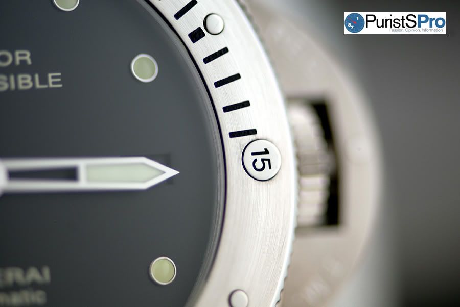
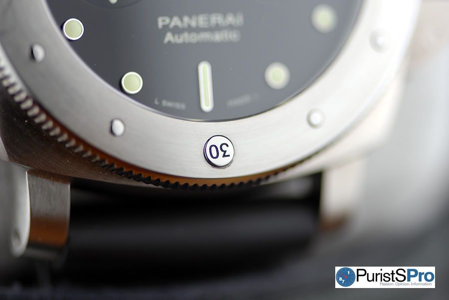
Notice how the 15 & 30 quarter hour markers are not aligned perfectly? They’re slightly crooked, especially the 30 minute marker. Please keep in mind that this PAM305 is a prototype and not a final production piece . I have asked several current PAM305 owners, and they all have said their final production PAM305’s have perfectly aligned bezel markers. So be rest assured that this problem is isolated only to this prototype, and bezel markers on production pieces are aligned properly.
The polished coin edge of the bezel adds visual sparkle to the overall look of the PAM305 and matches the polished gear edge of the winding crown.
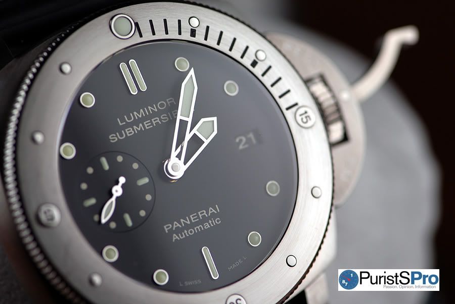
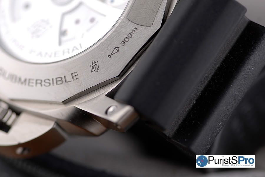
In the below picture, the sapphire crystal is flush with the bezel and has a very slight domed curvature.
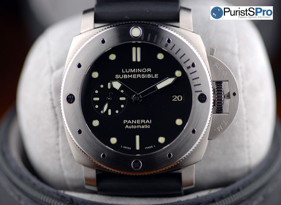
Dial
Before we take a closer look at the dial, let me bring to your attention a vintage Panerai where the PAM305 most likely got its design cue from – the mysterious ref. 2533.
Panerai vintage ref. 2533 (left) & ref. 3646 (right) with baton markers - picture by Asi
If you look at the above vintage Panerai’s, notice the baton markers at 12 and 6 o’clock. This is where the PAM305 most likely got its inspiration from. I don’t know why Panerai didn’t include the baton markers at 3 and 9 o’clock on the PAM305. Maybe we’ll see all 4 quarter hour baton markers in a future re-edition limited edition piece? If this piece ever comes to fruition, it would sell like hot cakes.
Panerai vintage expert Asi says he has only seen 2 watches with the “2533” stampings. And of these 2 watches, one had the baton dial as shown above. There is not much else to say about this 2533 since information on this vintage piece is practically non-existent. It also doesn’t help that there is no official Panerai documentation that this 2533 ever existed. We will never know the exact history, and this is why the 2533 remains a mystery.
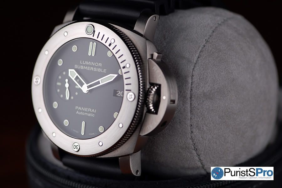
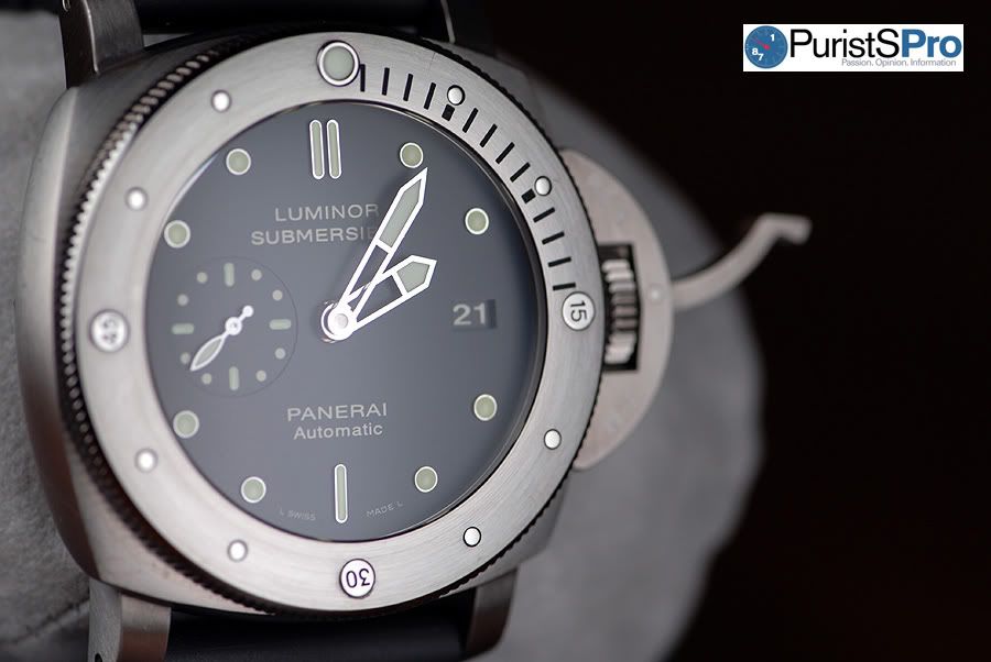
Going back to the PAM305, the black dial has a matte bead blasted finish which is only noticeable upon close examination. The polished hands are the same wide skeleton hands found in the Luminor GMT’s such as the PAM88.
Luminosity of the hands and hour markers is impressive. Every time I was outside in the SoCal clear blue sunny skies and moved to a shaded area, I would purposely look at my wrist to admire this “flashlight”.
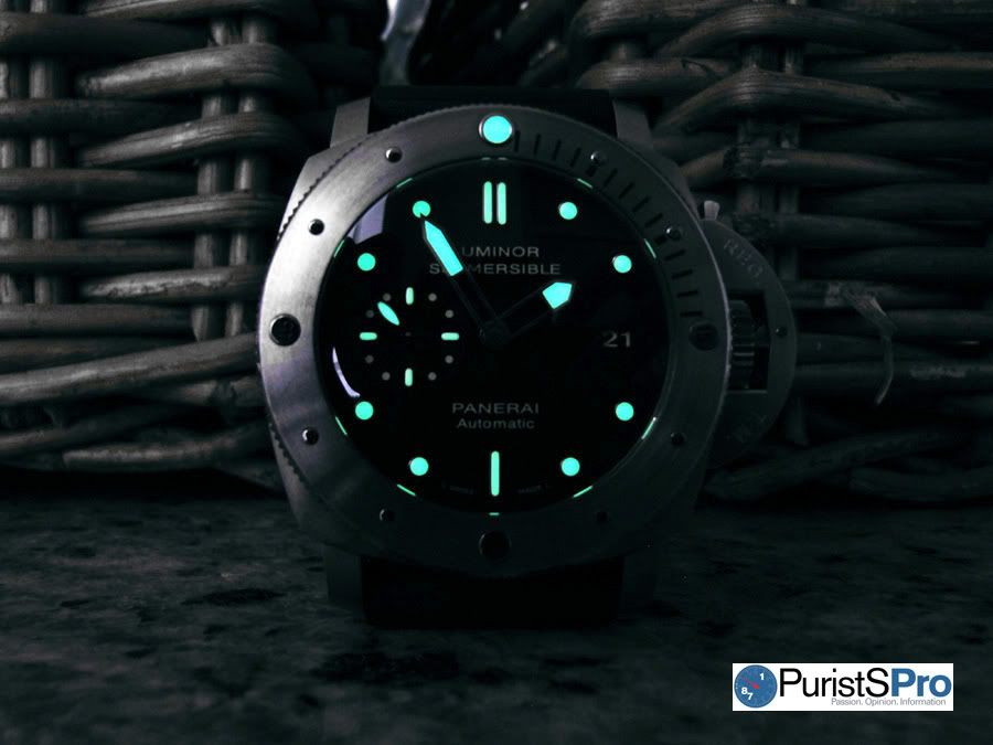
Up until several years ago, Panerai would use tritium on the hour markers and hands on all its diving watches, such as the PAM202 Slytech Luminor Submersible Chrono 1000m. Tritium is radioactive so it glows all day long and isn't dependent on light for its luminescence. It also has a half-life of 12.3 years which means after 12.3 years, on average there will be half its original amount remaining. And then after another 12.3 years, there will only be 1/4 of it left. So this is why tritium slowly loses its luminosity over many years.
Super luminova, on the other hand, doesn't decay but needs to be exposed to light because light "excites" the luminescent particles. These "excited" particles then generate the luminescence you see. And at initial full intensity, super luminova is brighter than tritium. However, the drawback with luminova is its luminescent intensity diminishes quickly. Depending on the quality of the luminova, luminosity can gets noticeably dimmer over a span of just a few minutes, unlike many years for tritium.
Below is a picture by Jester which shows the different patina of tritium and superluminova over a period of almost a decade. Many Panerai collectors prefer the look of a tritium dial than a luminova dial, myself included.
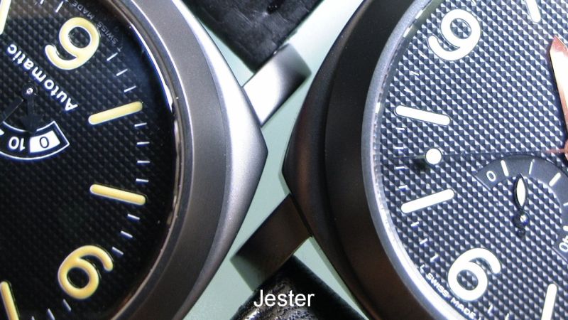
Tritium dialed PAM28 on left & Luminova dialed PAM28 on right
Panerai today only uses super luminova such as that found in the PAM305. Another reason why Panerai stopped using tritium is because as the tritium ages, it would sometimes flake off the hands and hour markers. These flakes would sometimes eventually find their way down in the movement through the various holes in the dial and then get stuck in the oils, potentially harming the movement.
The PAM305 is going to be a big hit IMO and if Panerai had used tritium instead of super luminova on the PAM305, it would probably be the ultimate regular production Panerai piece ever produced today for the Luminor fanatics. The patina of aged tritium is to die for IMO. This is why a Panerai with a tritium dial, in general, commands a premium over its luminova counterpart.
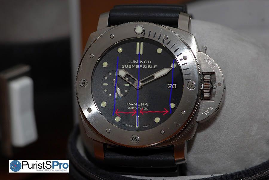
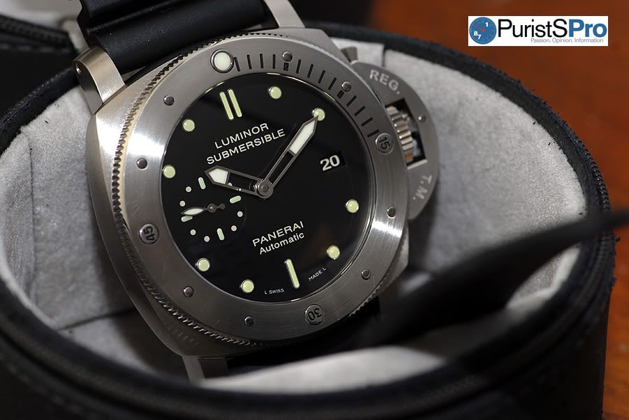
Going back to the dial, the 12 and 6 o’clock hour markers are no longer the Panerai standard large Arabic numerals but rather are rounded baton markers which are thicker than those found on the above mentioned vintage ref. 2533. For non-Panerai fans, this insignificant change probably doesn’t alter the look of the dial; but for the die-hard Panerai fan, this miniscule swap totally changes the entire look.
PAM243 Luminor 1950 Submersible 1000m
Compare the above PAM243 and PAM305 pictures, doesn’t the latter have a vintage look because of the baton markers? If not, then at least a modern look with a vintage twist? I definitely think so!
One minor problem I found with this PAM305 prototype is the applied luminova on top of the baton markers. In the below picture, notice how the luminova on the right-side 12 o’clock baton has been applied a little lower at the bottom end of the curved baton. Even though both batons are placed at the same height of the dial, the 2 batons look slightly misaligned because of the luminova.
If you're confused and can't follow what I'm talking about, below is the glow-in-the-dark picture again. The twin baton markers at 12 o'clock, notice the right baton is lower than the left baton?
As with the misaligned bezel markers, this luminova misalignment also appears to be isolated to just this prototype. I asked a friend of mine to check a couple production pieces and those were aligned. And on a side note, I wonder what the acceptable production tolerances are for luminova placement. With tolerances so minute, even if the luminova is misaligned inside the baton marker, you won’t even take notice when the PAM305 is strapped on your wrist. Only in extreme macros pictures such as above will you notice.
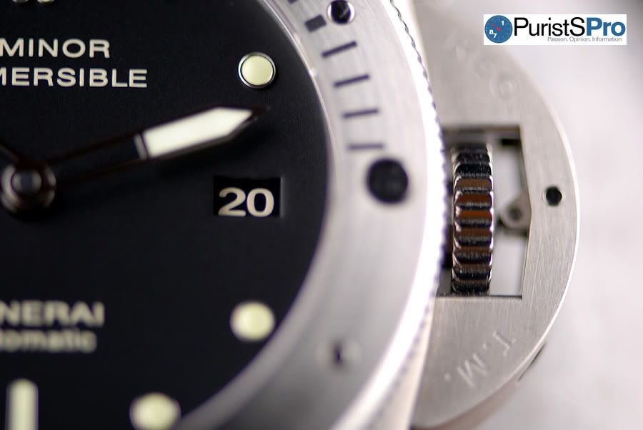
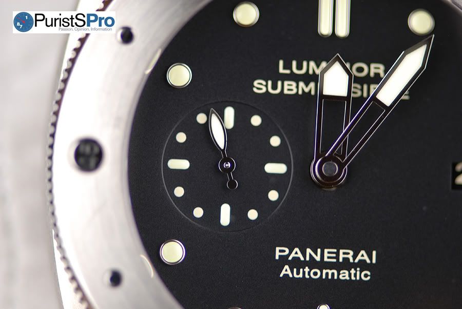
In the above picture, the rectangular cutout of the dial at 3 o’clock shows the date display. The Panerai designers did a great job because the date display blends discretely into the dial. The black background of the date disc matches the black dial, and the off-white beige date numbers matches with off-white printing on dial.
One thing I’ve always disliked about black dial watches is a white disc date background with black date printing (see below picture). Except for budget reasons, I never understood why many brands use this annoying black dial / white background date disc contrasting combination. It really is an eye sore IMO. I can only hope in the future for brands to put in matching date disc backgrounds on all their watches, even if the dial is blue, red, orange, or green. What’s living life without dreams right?
Unlike the watch pictured above w/ the contrasting dial and date disc, the PAM305 has a super clean dial. The only printing on the dial I wish could be removed is “Automatic” under “Panerai” at 6 o’clock. I never understood why Panerai always prints “Automatic” on the dials of their automatics because it clutters the dial with extraneous copy. Practically all the popular and “hot” Panerai’s don’t have extraneous copy on the dial such as the PAM190, PAM249, PAM232, PAM26, PAM292, PAM127, PAM21, among others (see below pictures).
PAM190 picture by Krieng
PAM249 & PAM232 picture by Asi
PAM26 & PAM292 picture by CraigLA
PAM127 & PAM21
I know I’m being a little anal here but I wish the seconds subdial at 9 o’clock were positioned slightly more to the left so it’s closer to bezel. The dial looks slightly unbalanced since the distance from the middle of the dial to the secs hand isn’t equal to that of the date. Making the distances equal requires extra modification of the movement, and brands, in general, don’t seem to place the upmost importance for perfect symmetry in their large sports watches.
I don’t want to single out Panerai since almost every single brand, if not all brands, have asymmetrical designed dials in at least one watch or another in their collection, if not all watches for some brands. But rather I’d like to suggest to the industry that when it comes to large sports watches, maybe it is time to start designing a large movement according to a symmetrical watch dial, rather than designing the movement first and then designing the dial afterwards to fit the movement. Fit the movement to the large dial and not vice versa. There’s nothing wrong with a large sized movement in a large watch, and smaller isn’t always better!
One thing though, I give Panerai kudos for designing a large P.2000 movement for this 47mm PAM305. Many other brands would simply use the same small movements that were designed for 36mm watches eons ago into their large 42mm+ sports watches. As a result, these watches would have dial layouts where all the functions and subdials are too centered in the middle of the dial. And to compensate for this, brands would add superfluous minute markers or tachymetres around the perimeter of the dial to make the dial look more balanced. Sorry to say, but that’s a big red X in my book.
Movement
I hope you don’t mind my above ranting  . Let’s examine the caliber P.9000 movement now.
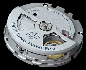
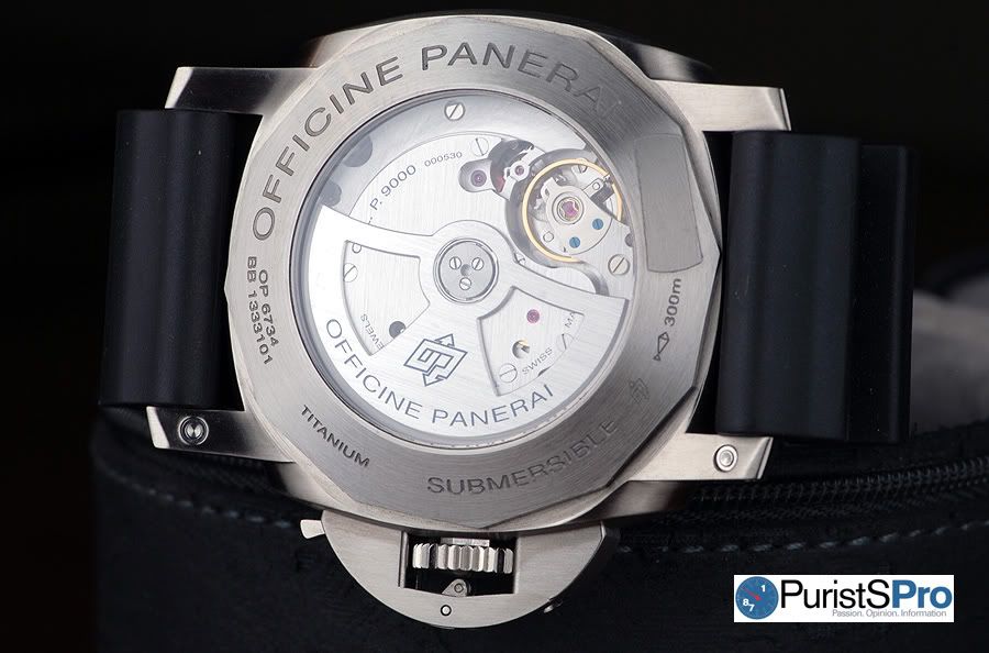
Panerai caliber P.9000
With a power reserve of 3 days, the caliber P.9000 is Panerai’s entry level in-house movement. Panerai is part of the Richemont Group family and developed the P.9000 movement in conjunction with Valfeurier, a Richemont Group movement development subsidiary. Some may argue the P.9000 isn’t technically an “in-house” movement, but in my book I still consider it “in-house”.
Either way, over a timed period of 7 days with the watch literally strapped onto my wrist 24 hours of the day except for when I was in the shower, the movement ran 23 secs slow, so that equates to -3.3 sec/day which falls well within COSC standards.
The P.9000 doesn’t have the added GMT or nifty seconds reset complications found in the P.9001 and P.9002 variants. I don’t mind not having the GMT feature because it’s really not needed in a diving watch. However the seconds reset complication would have been handy.
If you’re not familiar with the seconds reset complication, let me explain it briefly. Let’s take for example, if I wanted to precisely set the time to 2:00:00PM, I would set the hour and minute hands to exactly 2:00PM and then pull the crown out all the way and the seconds hand at 9 o’clock would automatically reset to :00. This makes for instant and accurate setting of the time. You no longer have to look at your watch and notice when it’s 2:00PM, the seconds hand is not in-sync and is positioned at 22 secs or any other non :00 seconds. Seconds reset is not that common, and I can only think of a handful of brands who offer this complication. I’m glad Panerai incorporated it in the P.9001 and P.9002 movements, but I wish they added it to the base P.9000 movement because it’s a subtle useful complication which would have made the PAM305 an even more coveted model amongst its small but growing “movement geek” customer segment, IMHO of course.
A handy feature of the base P.9000 is the ability to advance or reverse the date without stopping or hacking the seconds hand. With the crown pulled out 1 notch, you can change the hour. The hour hand jumps forward in exactly 1 hr intervals if you turn the crown clockwise and jumps backwards if you turn the crown anti-clockwise - sort of like a GMT hand. So if it’s February 28th and you want to advance the date to March 1st without stopping the seconds hand, pull out the crown 1 notch, turn the crown clockwise to advance the hour hand until the date changes from 28 to 29 to 30 to 31 and then to 1. The seconds hand will keep moving forward as if you did not change the time.
If you were travelling from Hong Kong to Los Angeles and going backwards in time to an earlier timezone, to change the date from March 1st to Feb 28th, you would do exactly the same thing above but turn the crown anti-clockwise.
Also note when you pull the crown out 2 notches, you then set the minutes hand. The seconds hand hacks in this position.
A little after 11PM one night, I noticed the date disc already initiating its date change sequence and was halfway completed. I didn’t bother to check again the next night to see if the date change would start early again. Just a trivial observation I wanted to point out since this is something you won’t find in the press release.
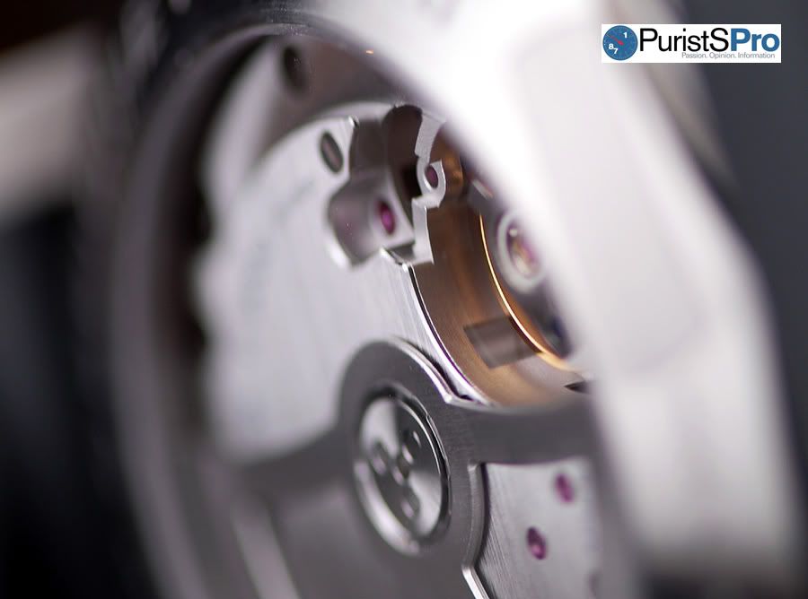
Now let’s take a look at the P.9000 movement finishing.
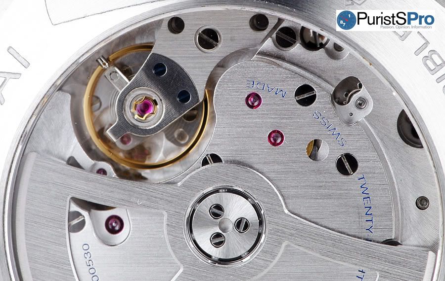
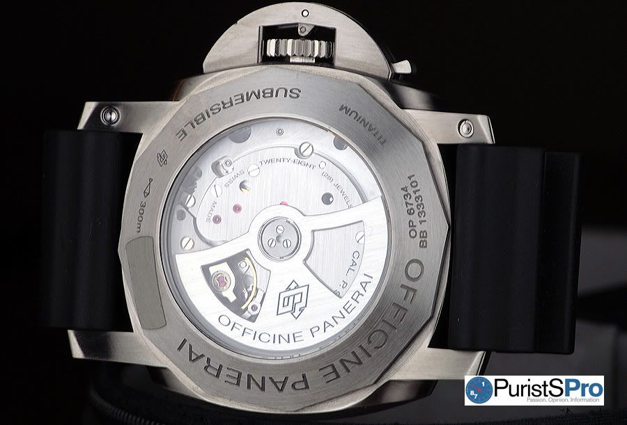
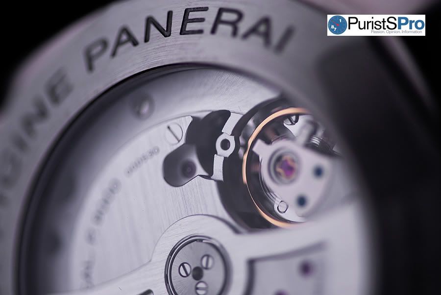
Upon inspection, the movement plates are brushed finished with no Geneva stripes. The bottom plate has perlage visible through the balance wheel, and the top plate seems to be the only plate w/ polished edges. Panerai refers to this as a tool watch finishing.
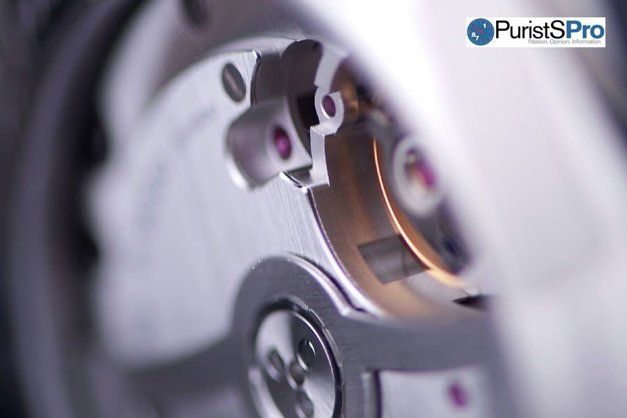
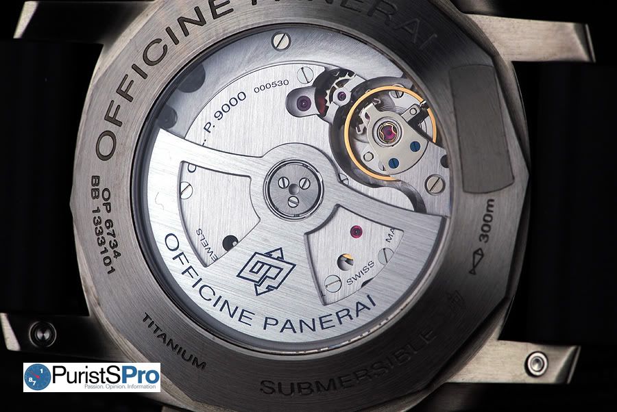
The entire movement is basically hidden from view (just like its older P.200X brethen), and I hope Panerai one day exposes more of the innards of the movement so the owner has a more visually stimulating view through the sapphire caseback. Even if there’s nothing to see, I still prefer a sapphire caseback over a solid caseback. Others may prefer otherwise but not me. Give me a sapphire caseback any day even if the movement is full of blemishes and scratches!
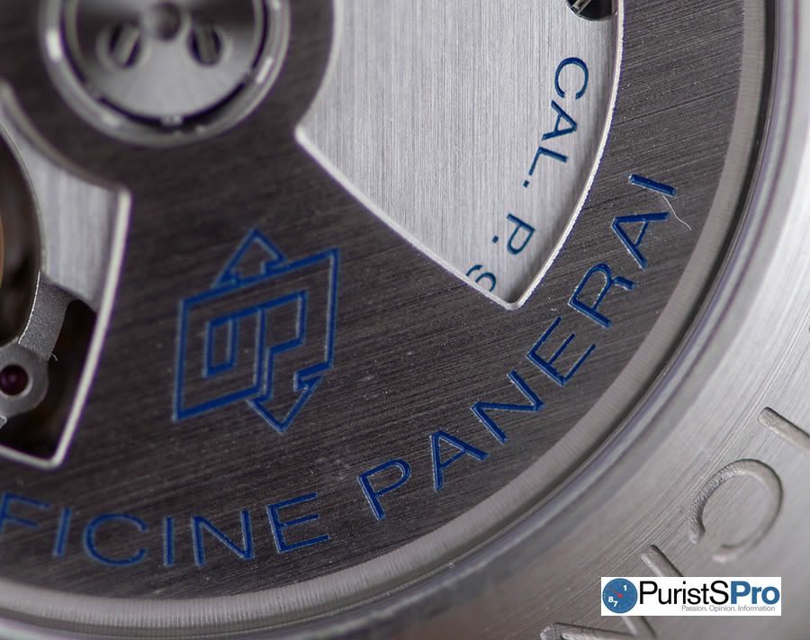
Pre-V OP logo engraved into display caseback
In summary, the movement finishing on the P.9000 isn’t something you would drool over upon examination with a loupe, but is as expected for an entry level base in-house movement.
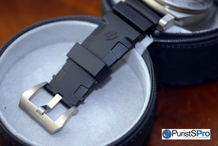
Strap & Buckle
I would be doing injustice to the Panerai strap-holics if I didn’t review the rubber strap. That would be blasphemy!
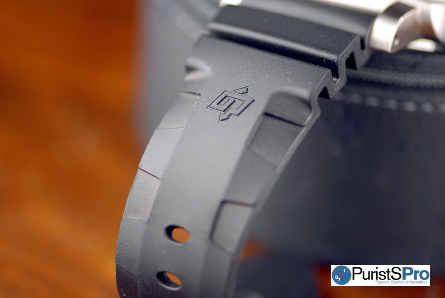
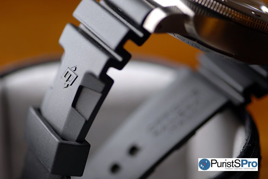
The PAM305 uses the newer styled Panerai rubber strap. At first glance, the design will remind you of the famous Seiko rubber strap w/ accordion ridges at the lug part of the strap.
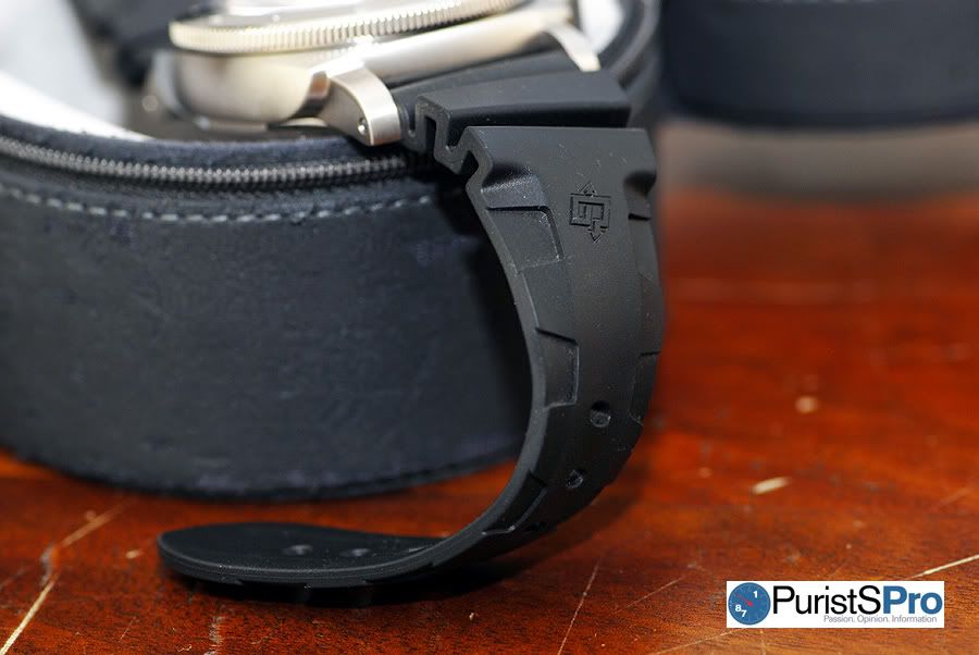
The rubber strap is personalized with the Pre-V OP logo which is a nice design cue. In terms of width, the strap measures a wide 26mm at the lugs and tapers to 22mm at the buckle. From the end of the accordion ridges, the strap measures 5.5mm thick and then slowly tapers to 3.3mm thick at the tail end of the strap.
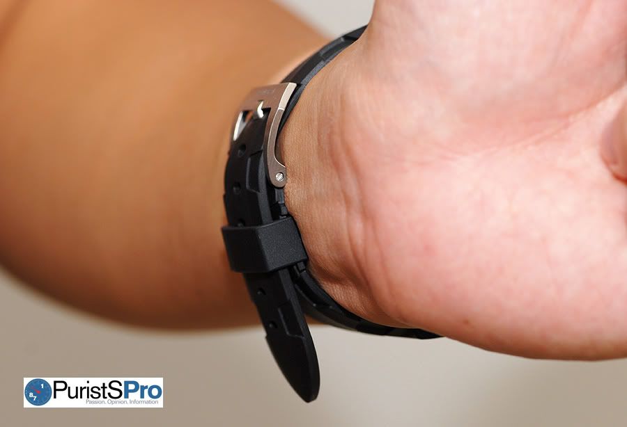
The sides of the strap are cut out to angle the strap downwards toward your wrist which enhances the softness and pliability of this thick rubber strap.
In the below picture, the underside of the strap is curved to conform to the curvature of your wrist which then provides for more surface area contact with your skin. As a result, the strap provides for more friction and grip so the PAM305 won’t flop around on your wrist as easily despite its massive 47mm size.
This rubber strap is a dust magnet, especially in the accordion ridge sections. Nevertheless, the comfortability far overshadows this trivial drawback. This strap is one of the most comfortable rubber straps I’ve ever worn and is far more superior in design than the original Panerai rubber strap.
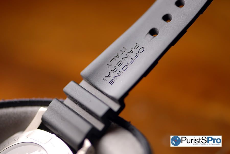
For those with 6.75” or smaller wrists, you will need to use the first hole closest to the lugs on a regular length strap. Look at the below picture. Notice the tail end of the strap protruding too much.
I have a nice trick for us small wristed folks. To make the tail end of the strap curve and stick to the other strap, simply force the keeper outside the keeper guide (you’ll have to use a little force). The once too long strap will now look like a bespoke strap for your wrist!
Panerai fans are notorious for their strap addictions, so if you want to dress your PAM305 with a different strap, swapping straps is an easy task. A second strap (black nylon strap w/ white stitching), screwdriver, and quick-set strap change tool are included with the PAM305. You can use the quick-set strap change tool, a ball point pen, or a toothpick to depress the quick strap change button located on the underside of the lug (see below picture).
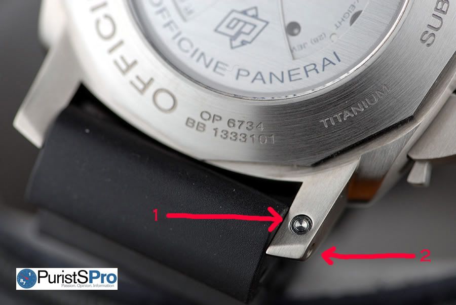
Taking the strap off is a breeze. You simply push quick set button (1) to unlock the strap pin. And then push the strap pin out (2).
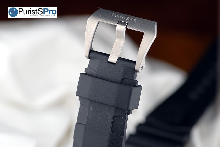
And if you’re wondering why Panerai includes a screwdriver in the box, you’ll need to use it to unscrew the 22mm titanium Pre-V style buckle.
Summary
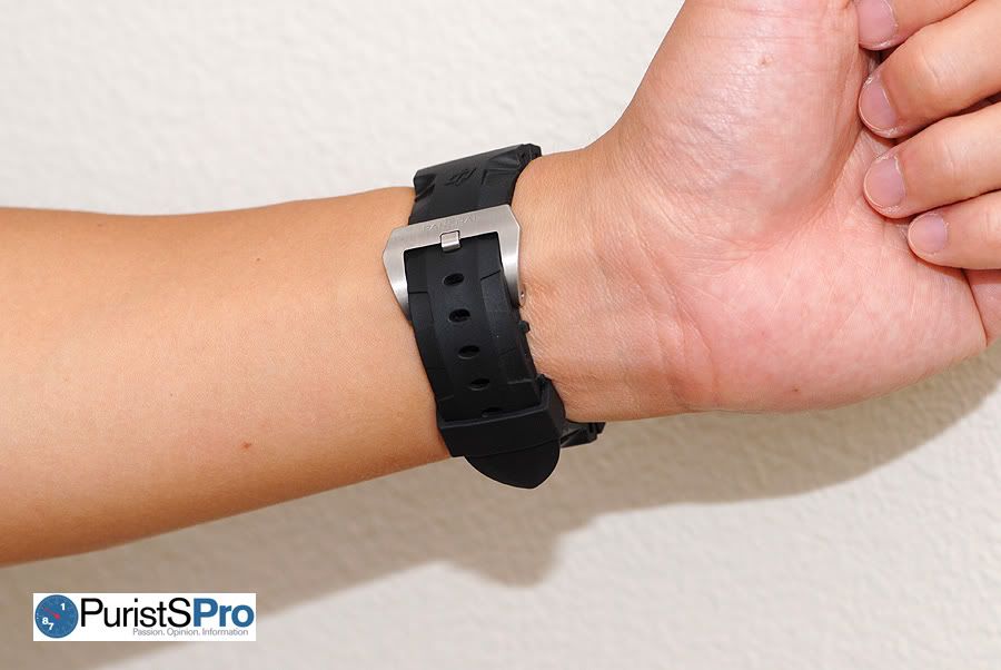
At first, the 47mm PAM305 Luminor Submersible seemed too large to wear on my small 6.75” wrist despite the fact that I’m used to wearing 47mm Luminors. The added thickness of the PAM305 bezel made the watch visually larger on the wrist. Maybe it was just a mental barrier? Because after a week, it didn’t seem too large on the wrist anymore.
With a current retail price tag in the $9k+ region, the PAM305 is a nice bang for the buck in relation to Panerai offerings. You get the new P.9000 in-house movement, a 47mm titanium case, a clean dial with 2533-like stick baton markers for a modern vintage look, and the ability to advance or reverse the hours and date without affecting the seconds. Perhaps Panerai will some day release a limited edition version of the PAM305 w/ the quick seconds reset feature? I hope someone from the Panerai design team is reading this! May I also suggest a 44mm version for those who want a smaller version?
Many Panerai collectors have already purchased the PAM305 or are seriously contemplating adding one to their collections. It’s definitely in the top 3 of my current to-buy-wishlist, and I hope to add one to my own collection in the not too distant future. My prediction for the PAM305 is it will be one of the most popular regular production pieces of all Panerai in-house movement models. Time will only tell and guess we’ll have to wait 5 years to see if I am correct.
**Disclosure: The watch in the review is one of Panerai’s PAM305 prototypes. I initiated the loan request for the PAM305 for the sole purpose of writing this review and then returned the watch back to Panerai. I did not receive any compensation or special favors from Panerai to write this review. I am and have been a long time Panerai fan, so my review may be biased but is honest and true to the heart.**
Specifications (from Panerai website)
Movement: automatic mechanical, Panerai P.9000 calibre, executed entirely by Panerai, 13 ¾ lignes, 7.9 mm thick, 28 jewels, Glucydur® balance, 28,800 alternations/hour. Power reserve 3 days, two barrels. Incablock® anti-shock device. 195 components.
Functions: hours, minutes, small seconds, date, calculation of immersion time.
Case: diameter 47 mm, brushed titanium.
Bezel: brushed titanium with polished edges, anti-clockwise unidirectional rotating bezel with graduated scale for calculating the time of immersion and ratchet click at minute intervals.
Back: see-through sapphire crystal.
Device protecting the crown: (protected as a Trademark) brushed titanium.
Crystal: sapphire, made from corundum, 4 mm thick. Anti-reflective coating.
Water-resistance: 300 meters.
Strap: PANERAI personalised rubber strap and large-size brushed titanium buckle. Supplied with a second interchangeable strap, a tool to change the strap and a steel screwdriver.
Additional Pictures
Copyright December 2009 - Anthony Tsai & PuristSPro.com - all rights reserved
PuristSPro Homepage | ThePuristS Homepage
Comments, suggestions, and corrections to this article are welcomed.

This message has been edited by AnthonyTsai on 2009-12-09 22:29:25 This message has been edited by AnthonyTsai on 2009-12-13 10:13:59
Panerai PAM305 Submersible “On-The-Wrist” Review

A Great Review of A Great Panerai!

Very nice work, Anthony.

According to ISO 6425
Perfect reasoning for why no baton markers at 3 and 9 o'clock

Panerai fever

I am SO crazy about this watch!

Great review!


Excellent review.
Apart from your referring to
Great review, Fantastic watch

Thanks for taking the time to put this together!
Incredible review..

Very well done!

Great review.....

GREAT review..nice work
I love the feel of a 47mm Luminor 1950 case on my wrist

great report


Nice review of the PAM305

Your reviews set the standard Anthony.


outstanding

Very comprehensive and informative review.
Great review Anthony :-)

Maybe the best watch review I've ever read! BRAVO!!!
I don't know about your Walt Odets refernce :P
Great Review and Fantastic Watch
The Montblanc Rieussec is an awesome watch

Anthony, nice review.
Totally lucid, explicative, with many facts & figures...... All in all GREAT!!!!
Thanks Jonathan

Jeez, if I keep visiting this forum, you might get me hooked, Anthony . . .

Thanks for spending so much time to share.....
Resistance is futile Art


That's what you call a review

Thank you all for your kind comments and glad you enjoyed the review

Great review Anthony.
Great post helps my decision on PAM305